[Archive] Opico
UX![]()
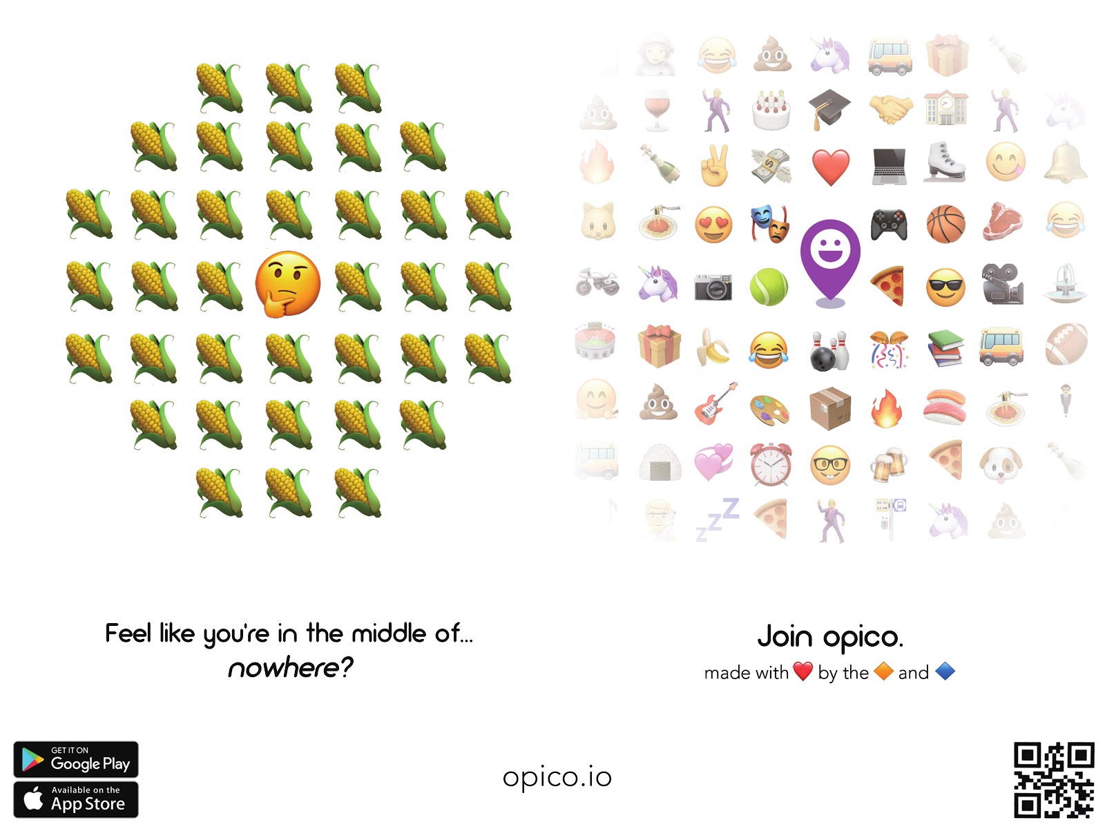
OPICO, know where your friends go.
OPICO, short for “Opinionated Emoji Collection”, lets you share and discover places through emoji reactions. Users can explore a whole new level of communication: sharing thoughts about the new restaurant in town, express feelings about working at that cozy coffee shop.
Learn what your friends are up to - all through emoji.
Role
I worked as a UI Designer, UX Researcher, and a Product Designer.
The research group is under Professor Ranjitha Kumar, from the University of Illinois Computer Science Department. The team of 10 engineers worked to achieve a new way of expressing users’ thoughts and communicate through a non-verbal form of semantics.
Skills
- User Interaction Design
- User Experience Research
- Html
- CSS
- Javascript
- React Native
- Adobe Creative Cloud
- Sketch
Duration
Jan 2018 ~ May 2018
User Flow Design
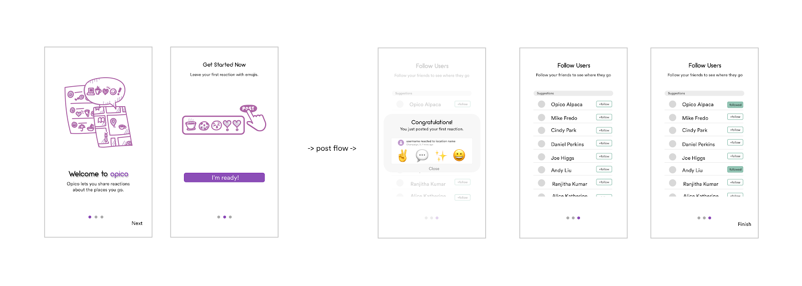
ONBOARDING FLOW DESIGN : SKETCH, ADOBE ILLUSTRATOR
When I first joined the team, I had a chance to blind test the application. I easily blended in the app, enjoyed the creativity and the innovative nature of using emojis. Nevertheless, when I introduced OPICO to my friends of all ages, I learned that the older generation(i.e. Professor X and Y from the Art Department, Uncle B from my mother’s side, etc) had a hard time going through all the functionalities.
OPICO should not be a platform for only the younger generation. Targeting the less tech-savvy would benefit user growth by a lot. I thought a good way to help them get introduced to the platform is to create an onboarding flow.
I designed an “user guide” for the new users, using hand drawn graphics. The flow would introduce the main posting interaction and lead the users to add new friends. By adding people who they know(or don’t know), users can feel a sense of belonging which will make them come back later on.
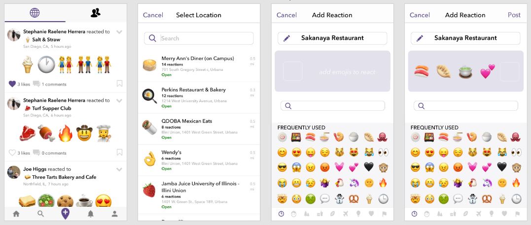
MAIN POSTING FLOW DESIGN : ADOBE XD
I recreated the main posting view where users can submit their emoji reaction to a certain location.
The user flow of posting an emoji reaction is in sequence of “Select Location” and “Add Reaction”. However, the previous user flow lacked the hierarchy of the steps: selecting a location and adding the emojis happened in a same view, divided into two separate rows. This confused the users: they did not know there were two components of posting, and even if they did, it was hard for them to grasp which component comes first.
To fix the problem, the design team created three prototypes for different posting flow design. A/B testing was held between the three iterations, in order to decide on which flow has the highest return rate. The test flows can be found below:
Prototype 1 Prototype 2 Prototype 3
Branding
OPICO was selected to join the CHI 2018 Conference. Before meeting the public, the team needed a solid identity. In order to make the app stand out, I created graphics to ensure the playful branding scheme to the app.