[Archive] MyLegacy
UX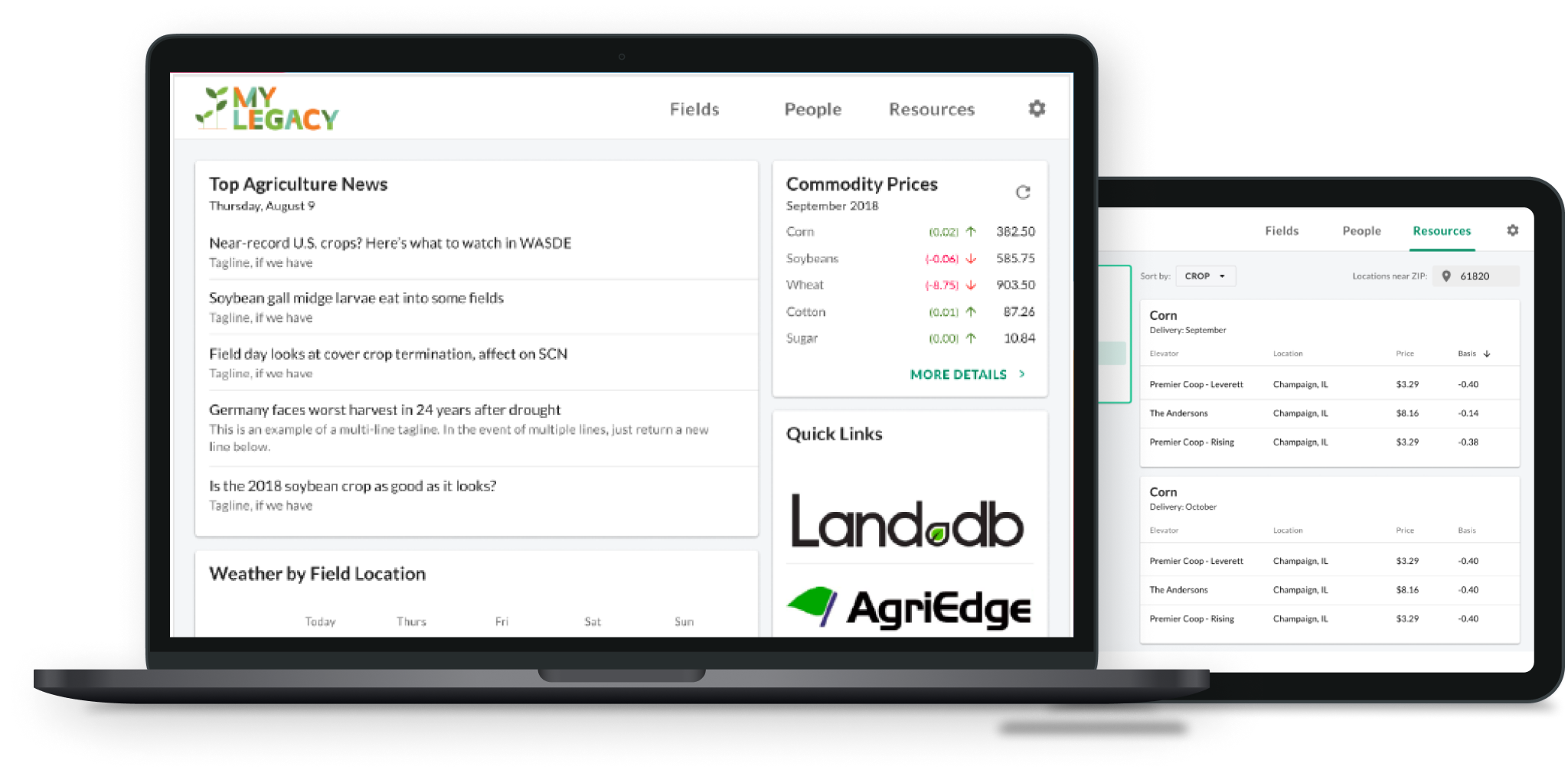
Farming requires more than just one person’s easy effort. It is a constant check-up with weather, it demands feedback from crop sources, and it takes inspiration from many people’s past knowledge. To obtain these facts, growers perform these actions: they download a weather app on their phone, check the news for crop prices, and go on the web for answers or call their fellow farmers.
Only if there is a platform that supports all the functionalities above.
Role
I worked as a Junior UI / UX designer within a team consisting of engineers, stakeholders, and designers.
The development team is located in Minnesota, while the design team is in Illinois. Communication is held on the internet.
Skills
- User Experience Research
- User Interaction Design
- High-Fidelity Prototyping (InVision, Figma)
- Agile Sprint Development Process
- Video editing (Adobe Premere Pro)
Duration
April 2018 ~ December 2018
The Problem
Syngenta is a worldwide agricultural company, with high emphasis on crop protection and farming value.
However, it is not that up-to-date with technology: the company does not have a solid platform that aggregates all the farming data it has for the users to access. Currently, Syngenta only contacts to farmers through customer hotlines(phone) and monthly flyer packets(paper).
As the farming world shifts towards mobile phones and desktop, the company is trying to catch up with the growers with a cross-platform web application that is basically an all-in-one farming assistant, supporting weather data, seed data, crop protection tips, and crop economics.
Design Process
This project runs on Agile Development Sprints.
The design team started a sprint in advance with wireframing, so the front-end developers can have a starting point for the overall layout. During the Two week sprints, the design team constantly went through iterations and created MVPs based on the developers’ pace and the stakeholders’ requests.
The Users
MyLegacy targets the growers in the community. The users we target varies in age group (between 30-65+), the main crops (corn, soy, wheat, potatoes, etc.), farm size (<50 acres to 500+ acres) and farming methods.
Nevertheless, they share same aspects that makes the website more attractive : they mainly grab their farming data online, usually on desktop, so they can print data out to take with them into the fields (along with the Syngenta handbook). Also, they are in need of a information-gathering forum so that they do not have to open ten tabs at a time.
The current user group are local corn and soy farmers in Illinois, Minnesota, and Ohio. Since adding a new state requires multiple data source from databases and APIs, we want to finalize the datamining process beforehand. We are aiming to expand the user pool to the States, moreover the globe.
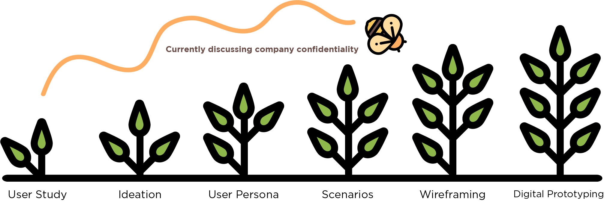
User Study Results, Persona , Scenario hidden due to company confidentiality (Testing Purposes)
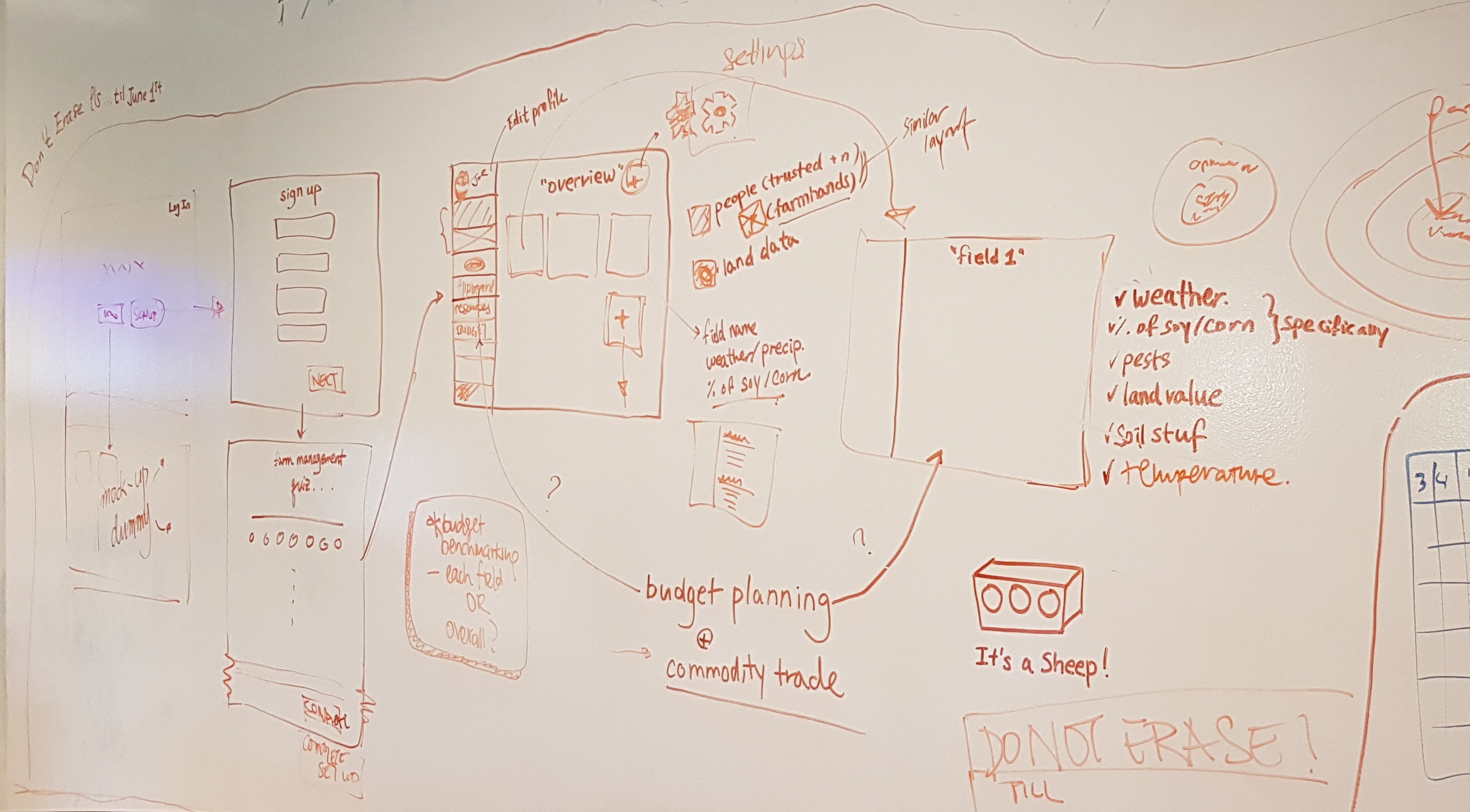
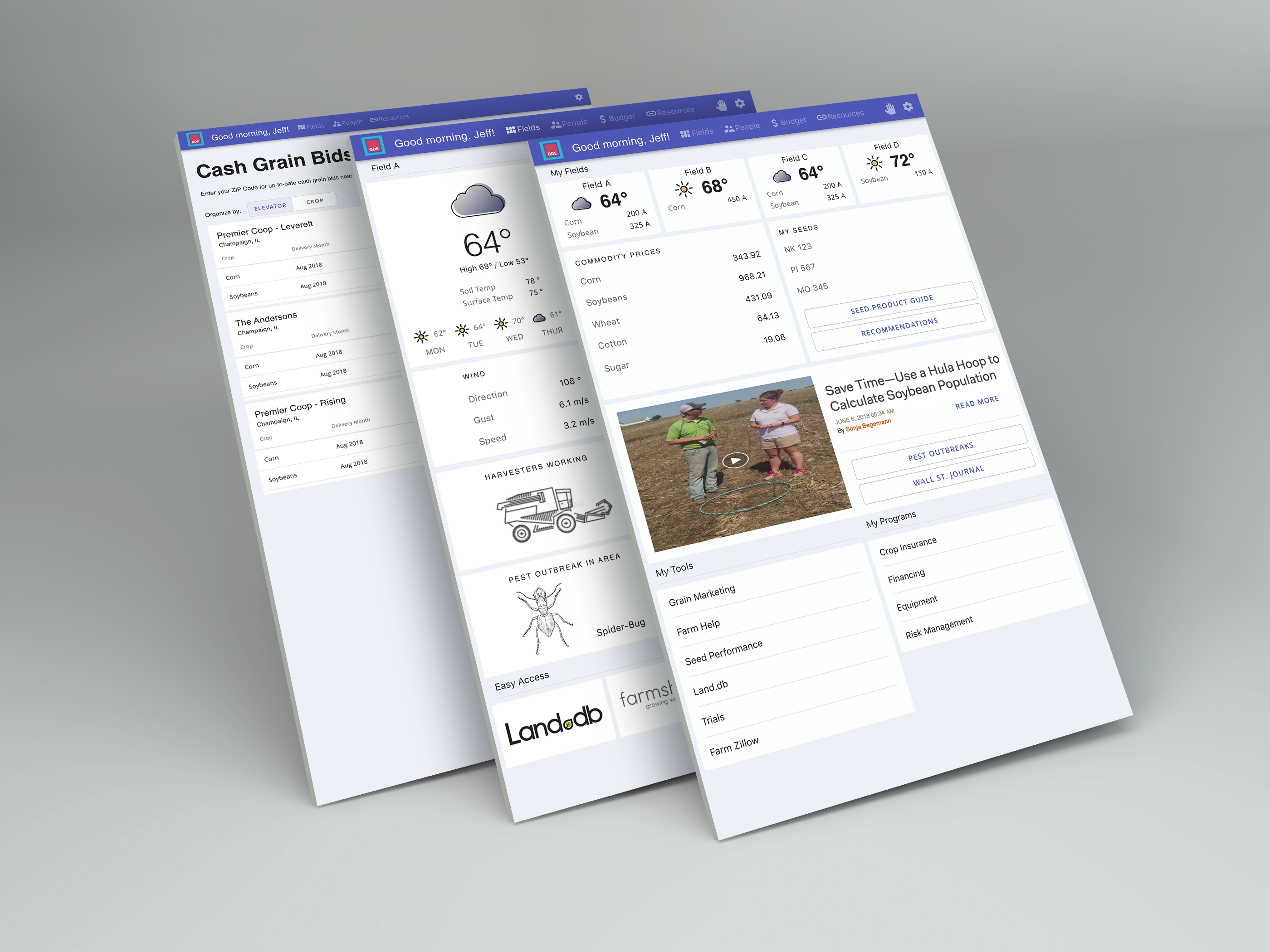
Initial Wireframe (Low Fidelity)
We implemented a “hub-and-spoke” approach: a central dashboard with links outward to specialized sections for field information, social network, and tools/resources.
The initial wireframe was a collaboration between the stakeholders and the design team using Google Slides: the buyers would create buttons and charts that represent the users’ needs, and we would group them in categories, and place them on the screen based on importance.
Even though the stakeholders wanted to place every widget in one dashboard view, the design team thought differently: we agreed that white space is necessary for the users to effectively consume the given data without getting overwhelmed. Since we categorized the above cards according to what users requested the most, we placed each column into one view and gave hierarchy between three different screens.
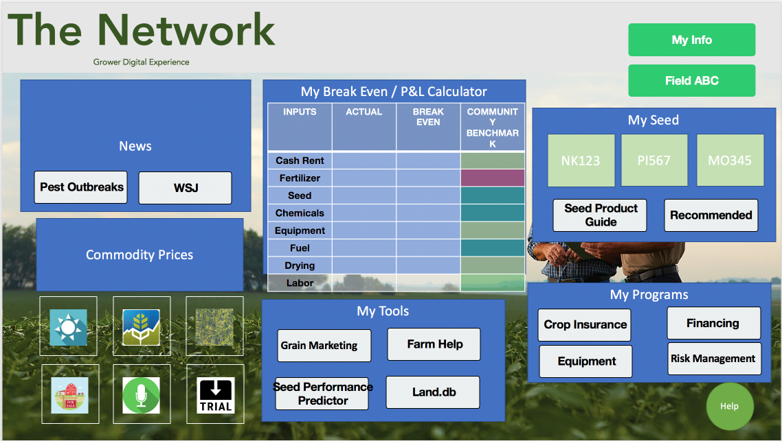
App Architecture Design Session
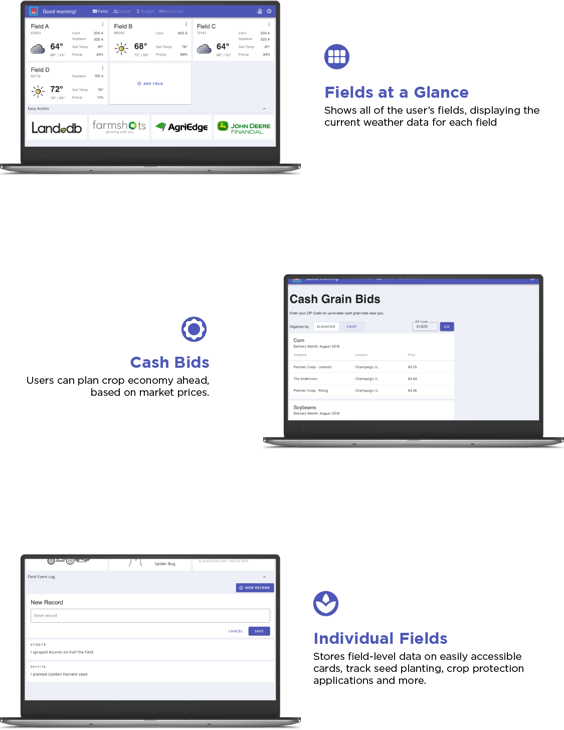
Mid Fidelity Wireframe, Using a Design Library Guideline
I created a mid fidelity mock-up to present to the stakeholders.
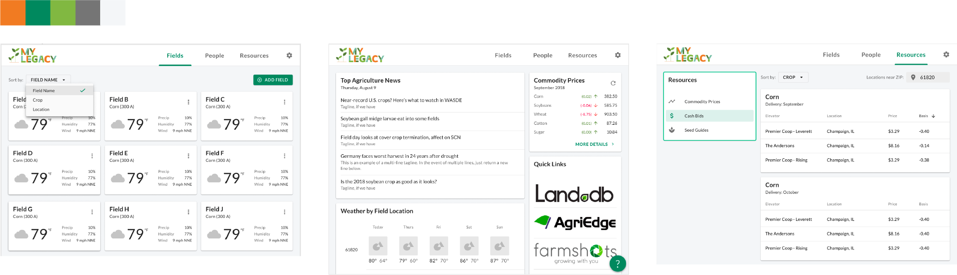
The application design guidelines follow Google’s Material Design:
We are using cards and grids, and try to fit all data in the 3-column grid system.
Features
Branding
One concern I had while designing the application was the main color palette: the given “brand color” palette(cobalt blue, grey, white) does not suit the agricultural, organic image of the app, nor the company itself.
Not only the color choice was weak but the logo design schemes throughout different project applications were also not unified. With determined minds, I and the other design teammates carefully asked the managers for a new branding session.
The office went through a three-week long branding ideation discussion. The discussion was held accordingly:
- Week 1 : Hold a Lightning Decision Jam to decide which area we lack the most as a brand (Color choice was voted as first)
-
Week 2 : Use different color schemes and design mock-ups with a sample brand app.
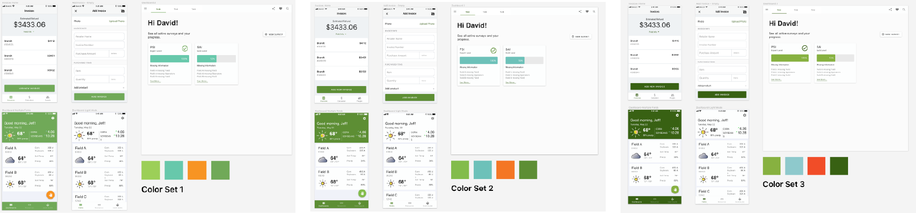
- Week 3 : Throw a company-wide A/B testing with each designs, solidifying with a color palette (Color Set 2 was chosen)
In the meanwhile, the managers changed the application name into “Mylegacy” (since farmers live on legacies, and it’s catchier than the 23-letter-long phrase).
Based on the Colors and the new name, we created a new logo and gave the screens a modern design.
Outcome
After final rounds of user testing with 34 farmers, we got a majority response that growers were very positive and were excited to have a simple tool for managing their farm operations. By aggregating the data and visualizing them, they felt that this would add a significant, positive impact on their day-to-day farm management and would lead to improved yields and profits in the long run.
The myLegacy product will also bring value to the business by increasing brand awareness, customer engagement, and — eventually — seed sales.
Mediation between Development and Design
Sometimes, like design processes, development does not go smoothly as wanted. The developers had blockers, especially regarding the interaction design and styling. Fortunately, I could be there to help. I suggested code review sessions and looked over the buggy code while the developers went through their code and their thought processes.
Although the design team has the app built on the well-documented Material Design, we sometimes got a bit creative and made it hard for the developers to build some functions. Whenever the development team had trouble implementing an interaction or a component, I wrote a sample code to solve that issue and shared it with them.
I felt valued working as a linking line connecting the gap between development and design, and satisfy the needs of both.