[Archive] ANNE
UX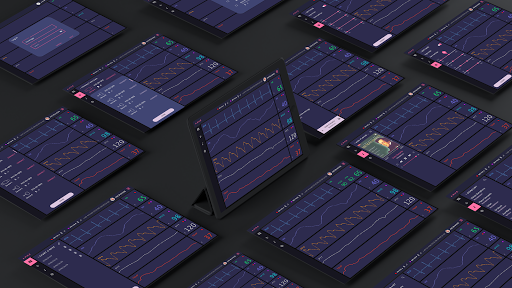
We see prematurely born babies rolled up in bunches of electric cords, settled in little units. Little do people know that sometimes the cords itself can outweigh the infant, restraining them from daily movements, which can lead to detainment of neonatal behavior development.
John Rogers Group has developed patches that works exactly like what the preterm infant machinery does, but cordless. The ded system works wirelessly as bluetooth devices, that interacts with portable devices to send health signals.
This project was directed by Steve Xu, M.D., CEO of Wearifi Inc. and instructor of Dermatology in Northwestern University Medicine School.
Role
I was the UI/UX Design Lead of the project team, which consists of iOS and Xamarin app developers. I was involved in all stages of the production including ideation, concept designs, and high fidelity prototypes.
I also developed the design baseline of the application, using Xaml and Stylesheets.
Skills
-
User Experience Research
-
User Interaction Design
-
High-Fidelity Prototyping (InVision)
-
Xaml Front-end Development
-
iOS XCode Storyboarding
-
Agile Sprint Process
Duration
January 2018 ~ August 2020
The Problem
The current ICU monitors support mostly cord-based medical devices. Even though some of the newer monitors support bluetooth, they have limits in connectivity or they serve solely for biosignal monitoring. We want to jump over that hurdle and actively lend a helping hand to the people concerned.
Babies are fragile. Prematurely born babies are even more delicate. A split of a second can bring them to the verge of defect, or even death. The sooner the doctors detect the signal change and get into the unit, the more likely said infant can survive without any harm. By effectively using wireless devices and cloud connection, the research group aim to shorten that alarming sequence.
Design Process
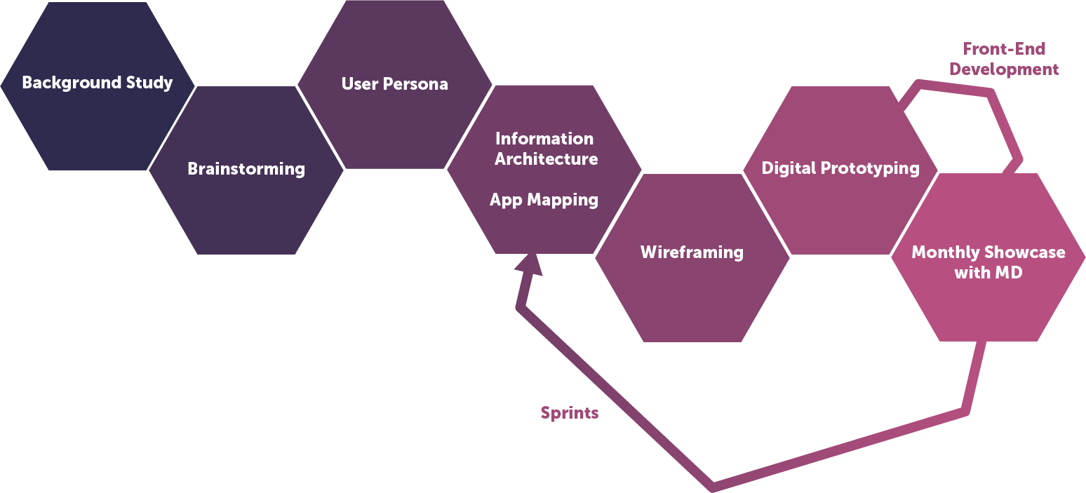
The team set the app development and process to happen concurrently, so we embedded a mixture of the Waterfall Process and Agile Sprint Process.
The initial process was held in a parallel Waterfall: while I was discovering and designing the initial version, the engineers made the database and the connected the embedded system to it.
After the baseline has been set for both development and design, we then started 2-week sprints to catch up the actual app creation for constant feedback exchange.
Background Study
Since this was an off-site, remote project, I never had a good hands-on interaction with my user pool: current doctors and nurses in the NICU unit. Instead, I went to my local hospital and questioned the pediatricians on neonatology, and gathered research papers regarding HCI in medical context - specifically concerning ICU notification. Here are some the references I used below:
-
The Quantified Patient in the Doctor’s Office: Challenges & Opportunities : Peter West, Richard Giordano
-
Designing Guidelines for Mobile Health Technology: Managing Notification Interruptions in the ICU : Preethi Srinivas, Anthony Falola, Gloria Mark
-
Usability of Portable Patient Monitor in Emergency Medical Services: An Evaluation of The Use Errors Caused by Interface Design : Yi-Sung Kuo, Hsi-Peng Lu, Ting-Kuei Kuo
Scenario
Using competitive analysis, I depicted a scenario about current ICU alarm systems and how we can shorten that alarm-detecting process. If we embed a alarming system throughout the cross-platform app, users can found out what is troubling the infant almost instantly, and react to it.
Another idea was the usage of the cloud data storage system, which can be used for the parents back at home: they can access the publicly charted logs and see how their child is doing.
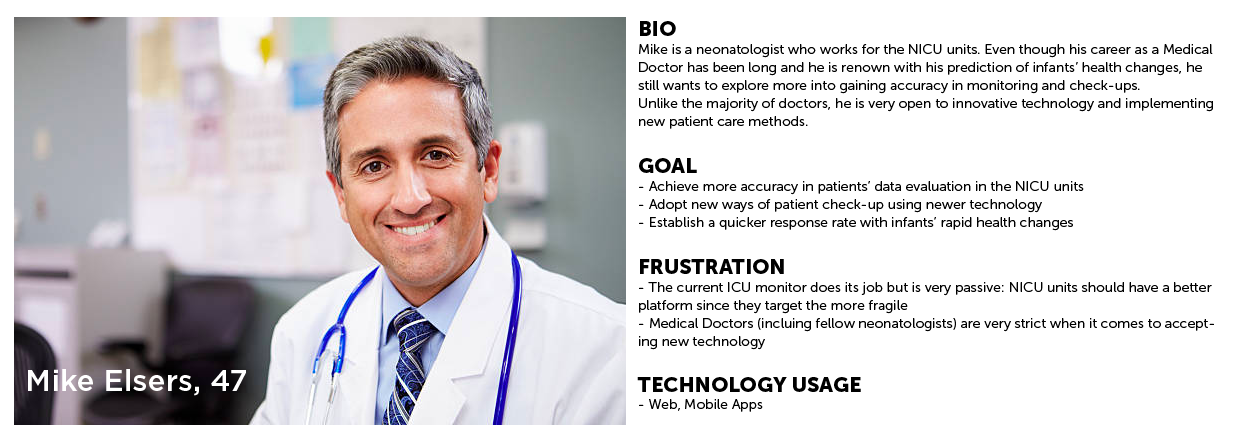
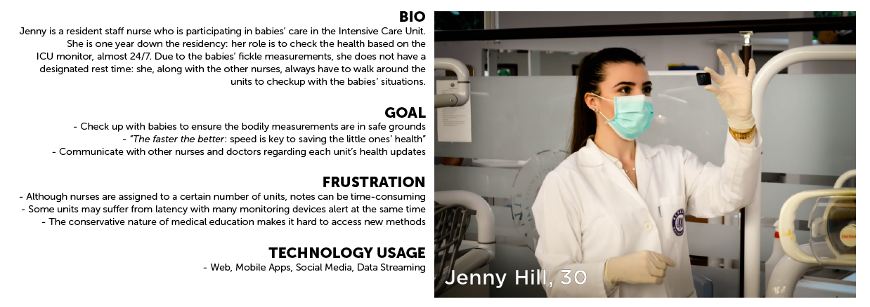
User Persona
Based on the papers along with the concept introduction from Steve, I found out the users share the common traits:
- Doctors and nurses are instinctually hesitant to access new media and technologies : maintaining a comfort zone(current ICU monitor) is necessary
- The average age of a neonatologist is about 45, so some of the users may not be familiar with a platform with indirect semantics
- Time is a very important factor in the NICU unit: anything with real-time data update will deeply help
- Charting and sharing health check-up notes would benefit the communication flow
I created two personas, each having different frustrations but share similar goal points.
User Map
 (click to expand)
Based on the user research, I created a user map that handles the main functions of the application. I tried to make every flow with the least taps possible, since the NICU unit depends greatly on speed.
App Architecture

Doctors and nurses are hesitant to try new features: this personality can be seen through the never-seem-to-change icu monitoring devices. Thanks to the monthly check-ups and constant persuasion with the hospital, the team got new functionality to implement every sprint or two.
The team is adding an Advanced Analytics view which will carry visualized data points based on logged data and accumulated alerts. This function will be in the later Engineering C version, launching in 2019.
Initial Wireframe
The initial features (Apr 2018) included:
- A log in scheme designated to each baby’s Patient ID
- A flow to connect the wireless patches via bluetooth
- A main monitoring page with graphs and calculations
- A note taking page with a cloud syncing function that allows cross-platform access
I created the wireframe with Balsamiq Mockups 3.
Design Iteration

As I presented the initial design to the developer group, the Agile Process began. Within every sprints, we discussed details, added on new features based on users’ feedback. For each sprint, I constantly iterated the design through wireframes and high fidelity prototypes. After two sprints (one month), we checked up with Steve with the up-to-date product in order to test the newer functions with the user pool, in Northwestern Medicinal Hospital.
We tried to embed the “Microsoft Windows Card” type of customizable environment in the first few iterations, until we settled down with a more stabilized design for the doctors to minimize interaction.
The main color scheme changed from whole greyscale to a toggle-able dark navy blue/light grey so that the users can easily access the app both in the morning and at night.
Branding
Starting September, ANNE was launched under a Startup business named Siebel Health under Wearifi Inc., a wearable electronics industry that specializes in everyday health care devices.
As the project broadened up its reach to the vast public, the team needed a more solid branding to uphold the app along with the company identity. Steve suggested we align the main color scheme to the company brand color, blue. To make ANNE even stronger as a product, I, with the help of Kelly Cao - another designer working under Wearifi - created the new logo and color palette for the iterated ANNE.
Outcome
ANNE Version A has been released with the iOS development help from the Wearifi team and Android development help from the Chero Engineering team.
The Team will be flying out of the country next year to Kenya for a first round of user testing. The application will be presented to the local hospital NICU units that are lacking health monitoring devices. I am more than thrilled to see the design being used for such a grand purpose.